
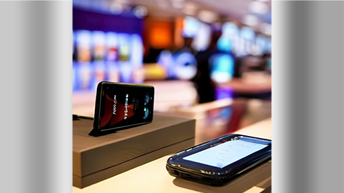
In today’s digital landscape, it’s essential for software developers and designers to take a mobile-first approach to software design. The increasing popularity of mobile devices has changed the way people interact with websites and apps, making it necessary for developers to prioritize the mobile user experience.
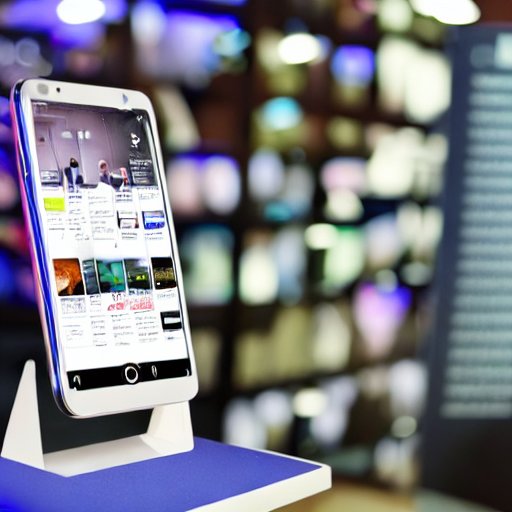
Mobile-first design is a design approach that prioritizes the design for smaller screens, such as smartphones and tablets, before adapting the design for larger screens, such as desktop computers. The goal of mobile-first design is to provide an optimal experience for users on all devices, regardless of screen size.
In this Article, we’ll explore the benefits of mobile-first software design and how to implement it in your software development process.
Advantages of Mobile-First Design
Improved User Experience on Mobile Devices
The most significant advantage of mobile-first design is that it results in a better user experience on mobile devices. Mobile-first design ensures that the user experience on mobile devices is given the same attention and priority as desktop devices. As a result, users are more likely to have a positive experience when using a website or app on their mobile devices, leading to increased engagement and satisfaction.
Better Website Optimization for All Devices
Mobile-first design not only improves the user experience on mobile devices, but it also leads to better website optimization for all devices. By starting with the design for the smallest screen size and then adapting the design for larger screens, developers ensure that the website is optimized for all devices, from smartphones to desktop computers. This results in faster load times, easier navigation, and a better overall user experience on all devices.
Better Search Engine Ranking
Another benefit of mobile-first design is that it can improve your website’s search engine ranking. Search engines, such as Google, prioritize mobile-friendly websites that have optimized layouts and Accelerated Mobile Pages (AMP).
How to Implement Mobile-First Design
Use the Right Tools First
The first step in implementing mobile-first design is to make sure you are using a compatible tools to ensure mobile priority. This means that you may have to research the best option within your scope of website or application.
As an example, an iOS App will be approached with the Xcode software, or an app builder like PowerApps. A website designed for mobile may only need an Accelerated Mobile Pages (AMP) plugin activated to solve many mobile hurdles.
With these differences in mind, note that your mobile friendly approach should be oriented towards the platform or service you are trying to provide.
Make Sure the Design is Responsive
Responsive design is a critical component of mobile-first design. A responsive design ensures that the website adjusts to the screen size of the device being used. This is important because it allows the website to look good and function well on all devices, including mobile devices, tablets, and desktop computers.
Each website host and builder will have an approach to this, WordPress allows for multi-device previews and quick AMP installation, which can solve these issues quickly.
Prioritize Content for Mobile Users
When implementing mobile-first design, it’s essential to prioritize the content for mobile users. This means that the content that is most important for the mobile user should be placed at the top of the page and be easily accessible. For example, the “Home” button should be placed at the top of the page so that it’s easily accessible for mobile users.
Another important aspect to keep in mind is that many API integrations will not be available on mobile or on AMP pages at times, you can find ways around this by providing alternative backlinks or turning off “AMP page” button on WordPress righthand bar
Test the Design on Multiple Devices
Finally, it’s important to test the design on multiple devices to ensure that it looks and functions well on all devices. This includes testing on different sizes of screens and on different operating systems. By testing the design on multiple devices, developers can ensure that the design is optimized for all devices and that the user experience is consistent across all devices.
Mobile First Design Sets You Up for Success
In conclusion, mobile-first design offers numerous benefits for software design, user experience, and website optimization. By starting with the smallest screen size, making the design responsive, prioritizing content for mobile users, and testing the design on multiple devices, developers can ensure that their website or app is optimized for all devices and provides the best possible user experience.
Mobile-First Design FAQ
- “What is Mobile-First Design?”
- “Why is Mobile-First Design important?”
- “How to implement Mobile-First Design?”
- “What are the benefits of Mobile-First Design?”
- “Why should you switch to Mobile-First Design?”
- “What are the best practices for Mobile-First Design?”
- “How does Mobile-First Design impact user experience?”
- “What tools can help with Mobile-First Design?”
- “Why is Mobile-First Design becoming the norm?”
- “How does Mobile-First Design affect website performance?”
- “What are the biggest challenges of Mobile-First Design?”
- “How can you test your Mobile-First Design?”
- “What are the key principles of Mobile-First Design?”
- “Why is Mobile-First Design better than traditional web design?”
- “How to optimize images for Mobile-First Design?”
- “What are the common mistakes in Mobile-First Design?”
- “How to ensure mobile compatibility in Mobile-First Design?”
- “Why should you prioritize Mobile-First Design in your design process?”
- “What are the different approaches to Mobile-First Design?”
- “How to make sure your Mobile-First Design is accessible?”
- “What are the latest trends in Mobile-First Design?”
- “How to make your Mobile-First Design responsive?”
- “What are the steps to converting to a Mobile-First Design?”
- “How to create a Mobile-First Design strategy?”
- “What are the key considerations for Mobile-First Design?”
- “How to make your Mobile-First Design user-friendly?”
- “What are the common misconceptions about Mobile-First Design?”
- “How to ensure fast load times with Mobile-First Design?”
- “What are the best resources for learning about Mobile-First Design?”
- “How to make sure your Mobile-First Design is future-proof?”
- “What are the differences between Mobile-First Design and Responsive Design?”
- “How to troubleshoot Mobile-First Design issues?”
- “What are the most important metrics for Mobile-First Design?”
- “How to optimize text for Mobile-First Design?”
- “What are the best plugins for Mobile-First Design?”
- “How to make sure your Mobile-First Design is SEO-friendly?”
- “What are the differences between Mobile-First Design and Adaptive Design?”
- “How to make sure your Mobile-First Design is secure?”
- “What are the best tools for prototyping Mobile-First Design?”
- “How to make sure your Mobile-First Design is easy to maintain?”
- “What are the key components of a Mobile-First Design?”
- “How to make sure your Mobile-First Design is scalable?”
- “What are the best resources for Mobile-First Design inspiration?”
- “How to make sure your Mobile-First Design is visually appealing?”
- “What are the best practices for creating a Mobile-First Design layout?”
- “How to make sure your Mobile-First Design is easy to navigate?”
- “What are the most important factors to consider when designing for mobile devices?”
- “How to make sure your Mobile-First Design is optimized for touch screens?”
- “What are the best approaches for designing for mobile devices?”
Images Are Rights Reserved